Multiple-group Comparison in Longitudinal Analysis
Published:
Introduction
A longitudinal dataset refers to datasets that contain two or more repeated measures. One big feature of this kind of dataset is the high correlations among those repeated measures, which violates the basic assumption of ANOVA and regression. The Proc Mixed (or Proc GEE) in SAS provides ways to specify the repeated measures. With an appropriately specified covariance structure, Proc Mixed is able to conduct longitudinal analysis conveniently.
In SAS, researchers can test a wide range of covariance structures directly in Proc Mixed. A flexible covariance structure allows more accuracy but requires many estimations; a restrictive covariance structure would save power but may raise bias issue. In the case of small sample size and multiple-group comparisons, researchers have to select the regression model and covariance structure very considerately to ensure an acceptable power.
Procedure
Descriptive Statistics and Overall Mean Trajectory: The descriptive statistics and overall mean trajectory is able to provide us a better picture of the dataset. Although at this stage we cannot select model solely based on it, we can still get some implications about the trend, which can help us to test models efficiently in later step.
Normality Test: Normality is an assumption of Proc Mixed. If the normality assumption is violated, Proc GEE has to be used. GEE is able to build model for non-normal samples; however, one disadvantage is that when choosing covariance structure, the Proc GEE in SAS only supports homogeneous covariance structure. Heterogeneous covariance structure cannot be tested.
Choose Covariance Structure: The most saturated covariance structure is the unstructured structure (UN). Simpler covariance structures can be tested against the UN by LRT (from Proc Mixed) or QIC (from Proc GEE).
Select Model: The most saturated model is marginal mean response profile model. After choosing appropriate covariance structure, we can build the marginal mean response profile model using the chosen covariance structure and test simpler models against it by LRT, AIC, or QIC, depending on whether the simpler model is nested within the mean response profile model as well as whether the normality assumption is hold.
Conduct Analysis and Interpret the Result: After both the covariance structure and the model have been selected, we can conduct the longitudinal analysis and obtain the parameter estimates from SAS output.
An Application Example
Below is an example for further illustration.
Dataset
This dataset contains 119 observations, 6 evenly spaced time points for each observation. The 119 observations had been randomly assigned to 6 groups (1 control group and 5 treatments) before the experiment. There were no missing or dropouts during the whole experiment. Since this dataset is very clean and well balanced, we can conduct longitudinal analysis directly without further processing.
Note: If missing or dropouts is presented, we would need to consider the missing mechanism and choose an appropriate method to treat the missing. If the experiment is not balance-designed, we may consider scaling the values to make the repeated measures comparable.
Purpose
The purpose of this example is to assess which treatment(s) is outperformed the control group. Since this example is not interested in investigating individual differences, I will use marginal mean model instead of mixed effect model.
Descriptive Statistics
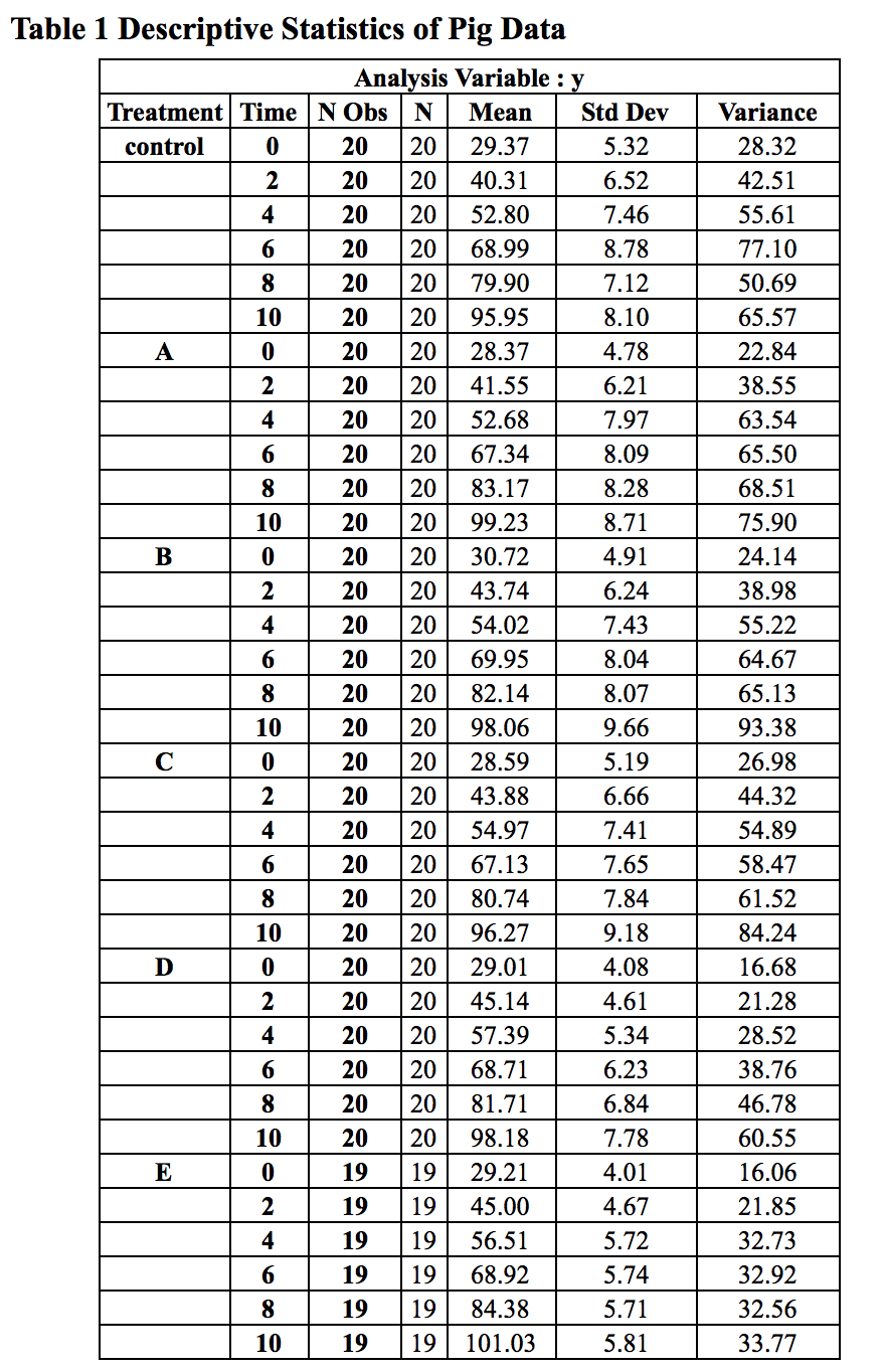
The descriptive statistics are shown in Table 1.
The mean trajectory of six groups over time is shown in Figure 1.
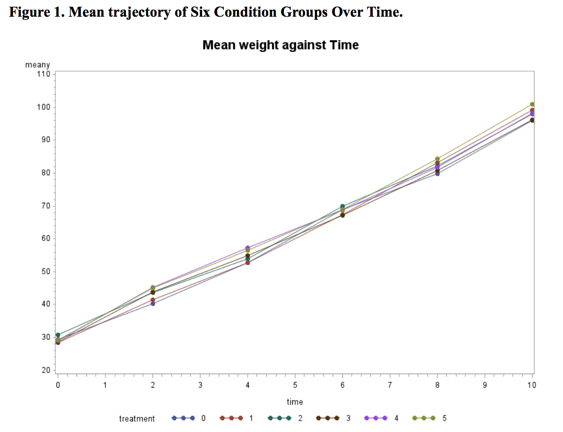
From Figure 1, we can see a strong linear trend evidence. This gives us implication to test linear model in model selection. Moreover, we can also see that the means of six conditions at baseline are very close to each other, which suggests that the randomization is successful. Considering that the sample size of this dataset is small (n≤20 for each condition), we decided to omit the treatment effect at the baseline to gain power.
Normality Check
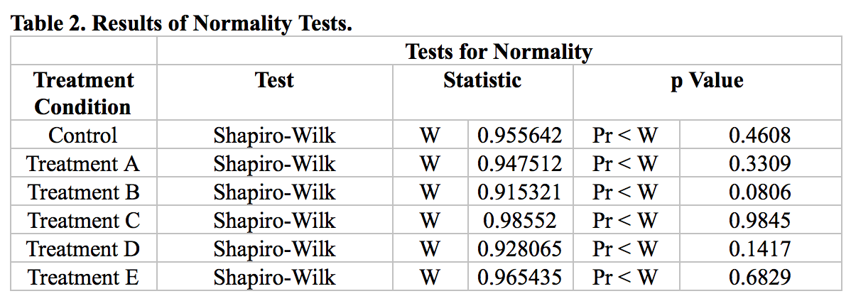
To test the normality assumption, we conducted Shapiro-Wilk test for each group. The results are shown in Table 2. None of the p-values are larger than 0.05. Hence, the normality assumption is retained. We will use Proc Mixed model in our following analysis.
Covariance Structure
Covariance structure was selected under Proc Mixed procedure in SAS. We first built a maximal mean response profile model using an unstructured (UN) covariance structure. The treatment effect at baseline was omitted. Six covariance structures were further tested: compound symmetry (CS), heterogeneous compound symmetry (CSH), autoregressive (AR(1)), and heterogeneous autoregressive (ARH(1)), toeplitz (TOEP), and heterogeneous toeplitz (TOEPH).
The correlations (upper right corner) and covariances (lower left corner) under unstructured model are shown in Table 3. Variances of each time are shown in the diagonal. The log-likelihood results are shown in Table 4.
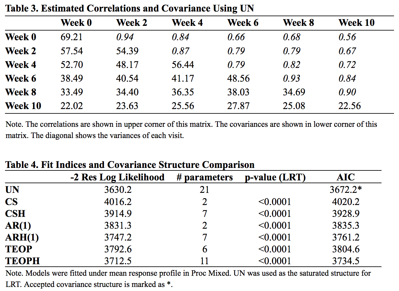
From Table 3, we can see that the variances ranged from 69.21 to 22.56. To test homogeneity, we conducted an Fmax test and resulted in rejection of homogeneity (Fmax = 3.07; df = 6, 118). In table 4, all heterogeneous covariance structures out performed their corresponding homogeneous structure with smaller AIC. The -2 log likelihood ratio tests were all significant, indicating that UN worked best.
Model Selection
Models were compared under UN with Proc Mixed procedure. Linear, quadratic, cubic, quartic, and response profile models were tested and compared. The LRTs were conducted between linear and quadratic models, quadratic and cubic models, and cubic and quartic models. AIC was used to compare fit among all models. Results are shown in table 5.
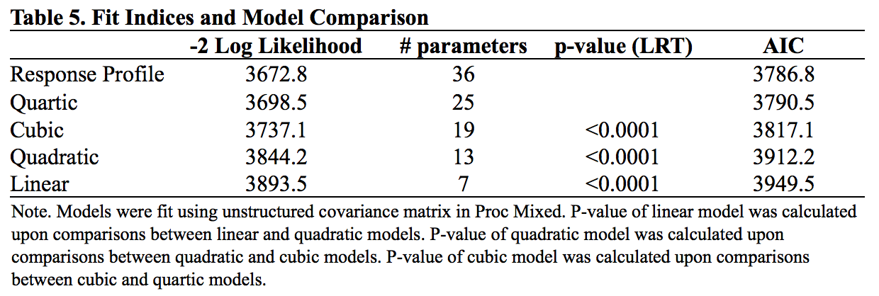
The LRT rejected all simpler models, so as AIC. Results indicated that Response Profile model provided the best fit to the data. However, considering the small sample size and the clear linear trend in marginal means, we still selected linear model. We will justify linear model using residual plot in later section. For now, the linear mean model that used for this example is:
Y = beta0 + time + time * beta1 * Treatment1 + time * beta2 * Treatment2 + time * beta3 * Treatment3 + time * beta4 * Treatment4 + time * beta5 * Treatment5 + error, where
- Treatment1 = 1 if in treatment A, 0 otherwise;
- Treatment2 = 1 if in treatment B, 0 otherwise;
- Treatment3 = 1 if in treatment C, 0 otherwise;
- Treatment4 = 1 if in treatment D, 0 otherwise;
- Treatment5 = 1 if in treatment E, 0 otherwise;
- Time is assumed to be continuous;
- Error is normally distributed and centered at 0.
Results
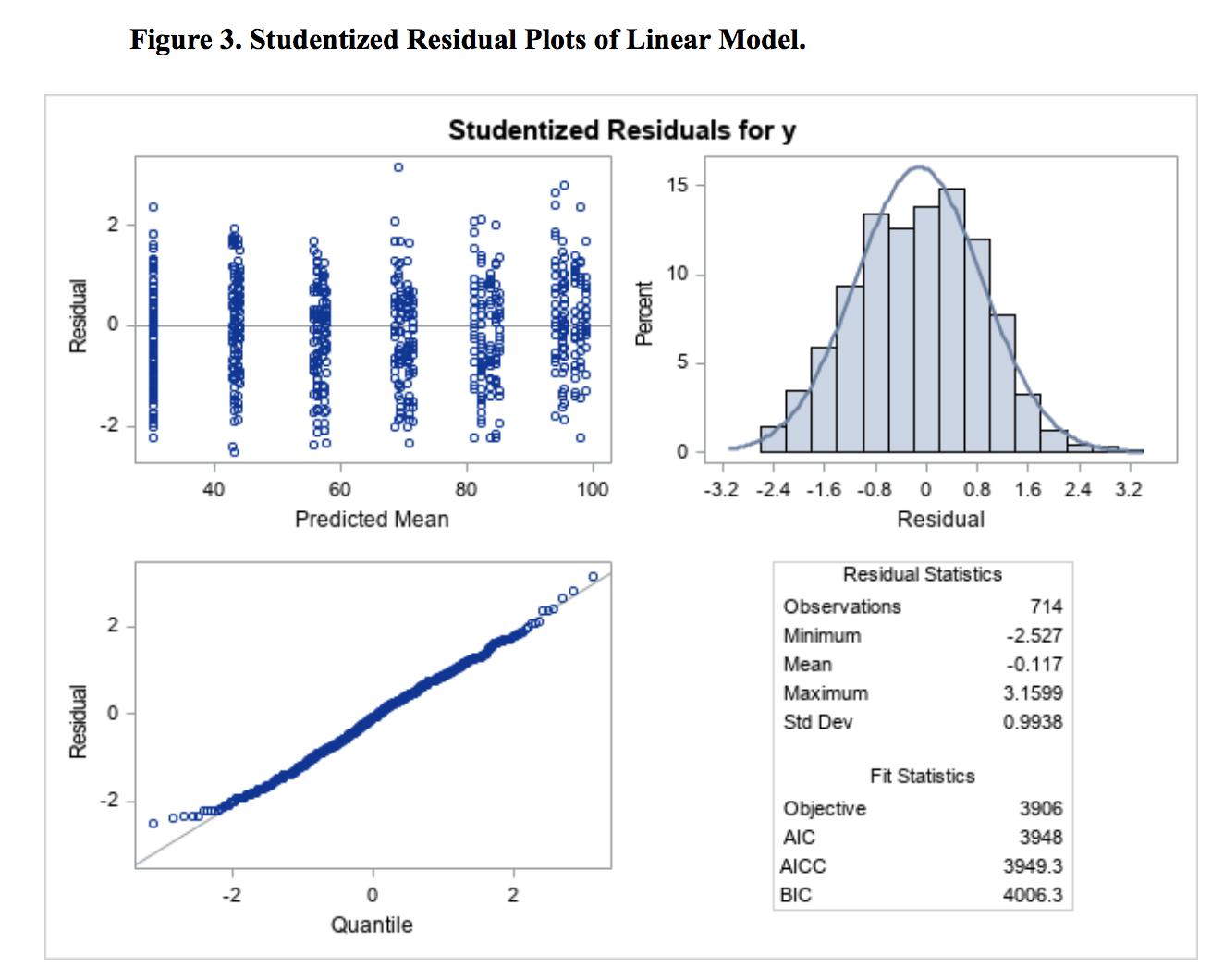
Residuals were plotted against predicted mean for model evaluation (Figure 3). From the plot, we didn’t observe a strong curvilinear pattern; the trend was quite linear, suggesting that linear model worked well. In addition, the normality assumption was also met quite well.
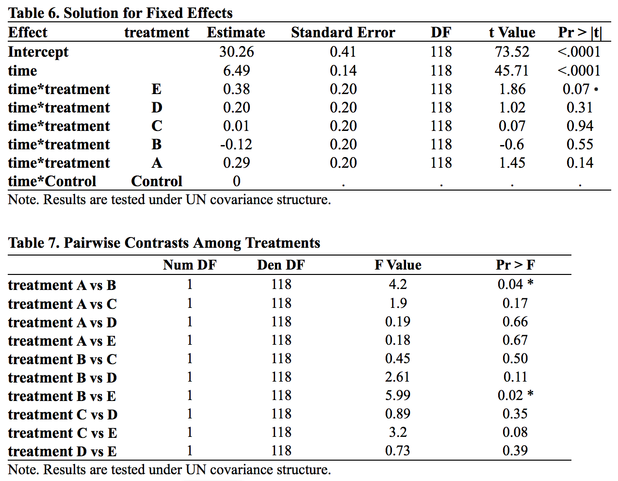
The parameter estimates derived from a linear mean model are shown in Table 6. Time has a significant effect, indicating grower pigs showed significant increases in weight over time, gaining an average of 6.49 pounds per week during the duration of the 10-week observation period (t = 45.71, p<.0001). This corresponds with the slope of the mean trajectory (Figure 1) being quite large. With regard to the primary research question, none of the treatments differed significantly from the control group at alpha = 0.05 level. While Treatment E (p = 0.0656) would have been significant if alpha was set to .01, the remaining four treatments have p-values greater than 0.1.
We also conducted contrasts among treatments, with results shown in Table 7. Two pairs of comparisons were significant at alpha = 0.05 level. While it did not differ from the control group (p = 0.55), Treatment B was significantly different from both Treatments A and E (treatment A vs treatment B, p=0.04; treatment B vs treatment E, p = 0.02) , which revealed that the weight gain effect of treatment B was closer to the effect of the control group and the effect of treatment A and E were slightly but not significantly different from the effect of the control group. Figure 4 is a conceptual graph of the interrelationship between these four groups.

Discussion and Conclusion
Our above analysis found that different treatments have different levels of effectiveness. Treatment B was found to be less effective than Treatments A as well as treatment E. One way to prove the relationship between treatment A, B, E and the control group is to make treatment B as the reference group. We can easily find significant effect in treatment E.
However, going back to the purpose of this example, we can conclude that no treatment outperformed the control group. None of the 5 Treatments was effective.
[Example code can be found here]